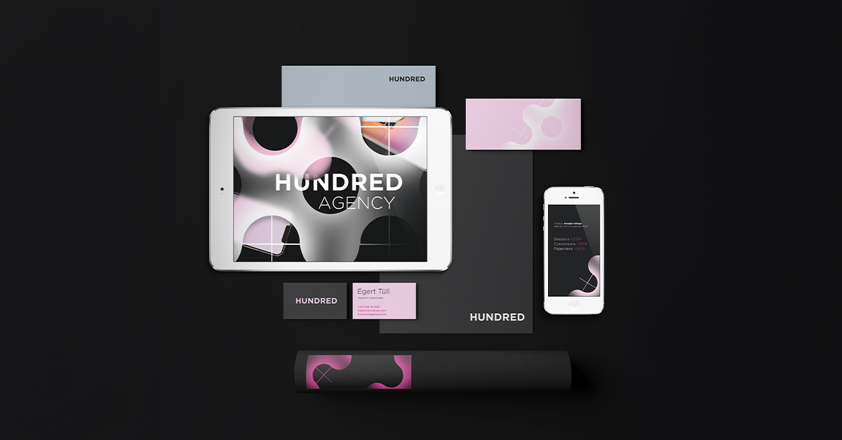
We are all unique, and the clearer our personal style, the more easily we are recognized. This principle seems straightforward, doesn’t it? However, it’s easy to overlook the fact that a company’s brand also requires its own distinctive identity to stand out amidst competition. Today we delve into this aspect: the face of a brand, known as Corporate Visual Identity (CVI).

CVI as a Core of Brand Identity
When establishing or refining a brand, it’s essential to delineate its overarching identity serving as a comprehensive foundation for the brand’s portrayal. Brand identity includes the company’s values, mission, tone of voice, style guidelines, unique value proposition, visual aspects, and much more – all aspects that evokes emotions in customers and become synonymous with the brand. Visual identity, a crucial component, represents the visual facet of brand identity.
A well-crafted brand elicits emotional responses from people. For instance, Volvo is associated with safety, reliability, and comfort. Merely glimpsing the Volvo logo – even without the car in view – evokes these qualities, eliciting positive sentiments. This achievement stems from a narrative built over time, backed by dependable products, and reinforced by a clear and consistent CVI.
By the way, did you know that consistent brands are 3.5 times more likely to capture attention than inconsistent ones? Visual coherence significantly contributes to this phenomenon.
Consider other examples like Amy Winehouse’s distinctive eyeliner and Donald Trump’s orange hair, Bolt’s light green and AirBnB’s pink corporate colors, Google’s and Samsung’s proprietary fonts, etc. When you see them, there’s actually no need for words anymore.
Thus, a company’s visual identity comprises various elements that collectively form a cohesive and recognizable image of the company.
It is a comprehensive system encompassing for example the logo and color palette, imagery and graphics, animations, icons and buttons, typography. Formalizing the visual identity into a brand book facilitates consistent usage of these foundational elements across all brand-related materials – from website to social media, from packaging to store design, from corporate clothes to promotional gifts, as well as flyers, brochures, outdoor and print ads. This ensures that anyone involved in creating, outsourcing or presenting any of the brand’s materials can easily adhere to the established guidelines.
Why Invest in Comprehensive CVI?
Developing a detailed corporate visual identity holds significance for organizations across all stages of development and sizes, encompassing startups and large corporations, NGOs, government entities, schools and colleges, etc. There are many reasons for this:
- Differentiation amidst Competition. Clearly articulating your values, personality, and offerings through unique and memorable visual elements enables you to carve out a unique niche in the market and address your desired target group.
- Brand Recognition. A robust visual identity helps your brand stand out in the market, fostering easy recognition among consumers. For example, consistent utilization of the company’s logo, colors and typography across various channels bolsters brand identity and amplifies its visibility.
- Building Trust. A meticulously crafted CVI reflects professionalism, instilling confidence in customers, investors and other stakeholders. A cohesive and refined visual identity can augment a company’s reputation, enhancing its credibility in the public eye.
- Stronger Customer Relationships. Visual elements such as logos and imagery possess the ability to evoke positive emotions and foster a sense of belonging among customers. This increases loyalty and may even transform customers into your brand ambassadors.
- Cost Efficiency. Establishing clear design guidelines streamlines the creation and production of branded items and marketing materials,, allowing you to use your time more efficiently and save costs.
Qualities of a Strong CVI
To ensure a company’s visual identity resonates effectively, it must seamlessly align with the brand’s essence. For instance, a law firm’s visual identity typically exudes classic and stringent attributes to convey expertise in a meticulous and detail-oriented field. Conversely, a smoothie bar’s identity is expected to radiate vibrancy and playfulness, catering to customers’ inclination for novel and exciting flavors.
As mentioned earlier, a robust CVI must be distinctive, yet possess a timeless quality. Simultaneously, it should exhibit adaptability, enabling updates over time without deviating significantly from its core essence. However, adaptability also entails flexibility, allowing for the creation of materials across diverse channels (from business cards to online and outdoor ads), markets and contexts while adhering to consistent guidelines. Ideally, a comprehensive CVI should seamlessly accompany the company through its various growth stages, from startup to a large corporation.
Moreover, alongside flexibility, maintaining sufficient consistency is imperative to ensure brand recognition and engender trust among the audience, averting confusion.


Five Steps Toward a Strong CVI
- Therefore, you first need to establish the brand identity. Read more about it, for example, in one of our previous blog posts.
- Then craft a compelling narrative that you’d like to tell your target audience. Stories are more memorable than isolated facts, so focus on the story in your visual identity. For example, Dove effectively communicates its inclusive skincare message through very diverse models.
- Translate the story into design using established design principles, and create a visual framework for your narrative through your in-house CVI rules. Professional input from designers may be invaluable in this phase to ensure alignment with design principles and avoid major pitfalls. Visuals greatly influence how people perceive a brand, so be careful.
- Ensure consistency. The bigger the brand, the harder it is to adhere to this requirement. The task is made easier with the aid of a comprehensive brand book, of course, once you’ve prepared one.
- Consider channels when applying CVI, because visuals may vary across different media channels. For example, a printed logo may appear darker than it does on screen. In order to ensure that all elements look the same in different channels, it’s better to entrust this task to a designer.
Adapting CVI to Evolving Needs
In the dynamic landscape of marketing, change is constant. Therefore, ongoing updates to the visual identity are essential. Monitor your brand performance, solicit customer feedback, observe competitors’ strategies, and align with the company’s trajectory to refine the brand’s face accordingly. While striving for consistency, be prepared to embrace necessary changes to stay relevant (see the example of Bolt’s strategic rebranding).
Wherever you stand in your brand’s visual identity journey, whether initiating it or contemplating revisions, remember that Hundred Agency stands ready to assist. Reach out to us at hello@hundredagency.eu, and let’s collaborate to elevate your brand’s visual identity!